
So here we have 2014 Topps Archives, a set that is way, way, WAY too overpriced (nearly 100 bucks for a hobby box?!), but is much too fun to ignore. With over 60 years worth of unique and sometimes-beloved card designs at their beckon call, and a bountiful variety of today's stars and retired heroes to choose from, this should be a foolproof product, right?
Erm... not really.
There are lots of things to love and look forward to with this year's issue, but, conversely, way too much to be pessimistic about. Because that's how Topps rolls. Nobody's looking for perfection, but the 'only game in town' ought to be a bit more dedicated to not screwing up their own products, am I right?
I was especially anxious for this year's release since the base checklist was 1/4 comprised of the '89 Topps design -- my all-time favorite, as stated countless times on this blog previously.
I was also excited to see the early 200-card checklist, noticing some new names and more variety from both retired and active players. Sure, you've got your usual Mickeys and Teddy Ballgames, but also a Bruce Sutter and a Larry Doby to spice things up. And that's a good thing!
But just when you think Topps has submitted an A+ project... Well, where should we start?
Oh, before we begin, I'll just mention that all the images you'll see were lifted from various places around the 'net. I haven't had a chance to grab any of the stuff for myself. Hell, for all I know, it hasn't hit the shelves yet in my neck of the woods. Anyhow...
It's like deja vu all over again, as the best brains at Topps HQ decided to revisit the 2012 Archives set and use the 1980 design for a quarter of their base checklist. Have I mentioned recently that Topps has 60+ years of card designs to muse over? How can this be?!
 |
| Didn't we just leave this party? |
This is beyond just a gaffe of quality control; it's Topps flying a stadium tarp-sized flag of indifference towards the consumer. At least towards the little guy, like me--and maybe you. They know that the big-time case crackers and dealers will eat the stuff up regardless, so why bother to show any sort of care towards the insignificant base cards. Nobody collects sets anymore, do they?
Okay, so we have to suffer through more 1980 base design in this year's set. Not that I hate the '80 design, but I'm liking it less today than I did yesterday thanks to such saturation. But, let's get back to the actual checklist and the dirty two-letter abbreviation: SP.
With the previous two years, in addition to the 200 base cards, Archives has had a 40-some card SP checklist that consisted only of retired players, aka "fan favorites." And that was okay with me, since I could choose to ignore the SPs without sacrificing a base set that lacks a big-name current star or rookie.
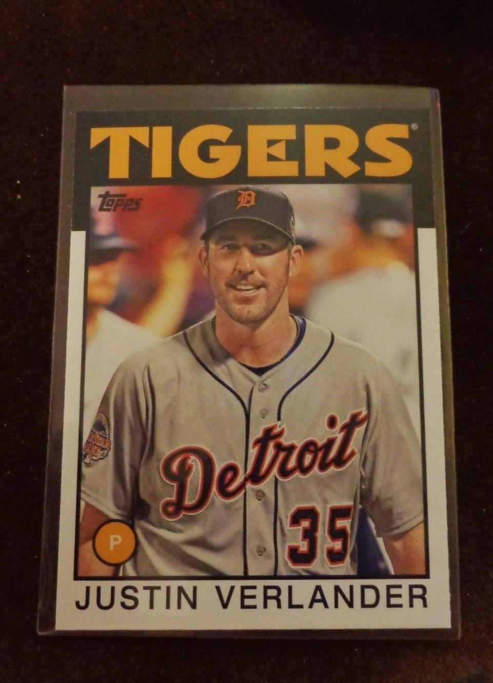 |
| A rare Tiger, indeed. |
But, you guessed it, the short-print virus has officially and fatally spread to Archives this year. Fifty cards of short-print absurdity, now including present-day players mixed in with the retired guys. Stud young players such a Puig, Wheeler, Tanaka, and Juan Abreu along with established stars like Trout, Kershaw, Verlander, and Tulowitzki have been filtered into the hell we collector's know as the SP list.
You better hope you get your Tanaka or Abreu rookie in a pack, otherwise you'll be gouged to kingdom come by faceless eBay sellers and pudgy-fingered venders at card shows. Because, y'know, those are the only guys who truly deserve to get highly-sought after rookies nowadays.
Another thing that burns me--and this might be a nit-picky one, but it's my favorite set--is how they've fudged up the font centering on the '89 base cards.
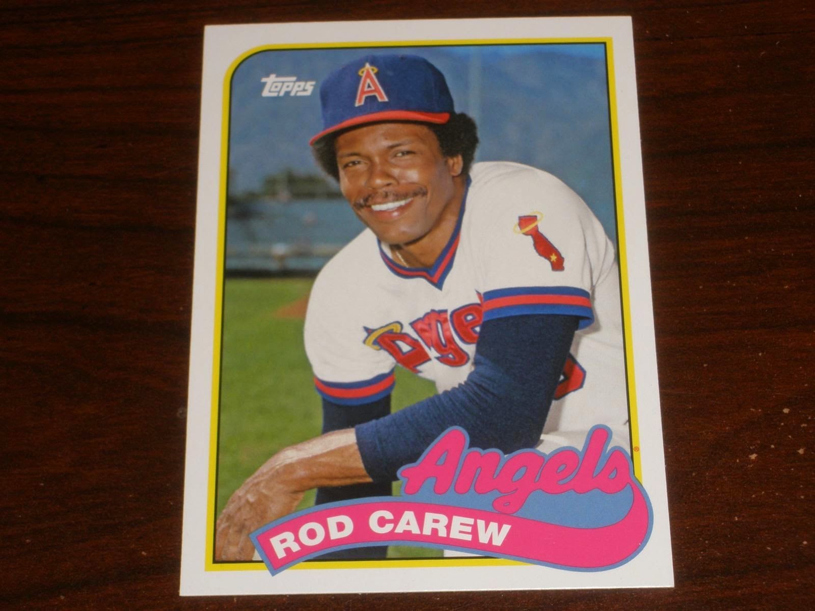 |
| If only his last name was Carewski... |
Again, my apologies for lifting another kitchen table image. But can we focus on all the empty space inside the banner to the right of Carew's name? What the bloody hell? Did somebody tilt the card to the left, making all the letters tumble accordingly? That's kooky!
Compare that to this. An actual 1989 card featuring a player with an even shorter name than Carew:
 |
| Proper! |
Ah, centered! Like it's supposed to be. Can anyone honestly look at these two and not see how one is centered perfection and the other is flagrant laziness? From the images I've seen so far, there are more cards suffering the unbalanced fate of Mr. Carew than otherwise. Pretty deflating, even if we're just talking about something so trivial.
I'd like to go on, but I'll save that til I open a few packs and have more ammo. Plus I'm sick of lifting images.
Don't mistake me, I'm still going to buy this stuff and be a good little soldier, forking over money to Topps that I should be spending on other annoying things like food, electricity and diapers. To be fair, I think there will be a lot of neat things to discover in this set. From the looks of it, there are some pretty great inserts and a host of outrageously fabulous Fan Favorite autographs (Lenny Harris as a Met!!!!!!!).
But, what fun is it throwing rose petals at the feet of Big Business? Gotta try to keep these guys honest somehow.
Though, by the early looks of it, it seems that our many varied attempts previously have gone unnoticed.
MK
The fact that this year's SP list isn't filled with fun, semi-obscure players of yesteryear killed any interest in the set. It is far more fun to hunt for a SP of Kevin McReynolds than Zack Wheeler, simply because Archives was the only place you could pull them in 2012/3/4. I did grab the Mets in a group case break, and came up with 4 of the 5 autos the Mets had, getting Mookie, Olerus and the Lennies (Harris & Dykstra). I only need HoJo to complete that set. I'll assume all the SPs and varied inserts are there as well. My big complaint is that the previous years saw the player correspond with years they were with the team. Why would they use an '86 for Olerud and a '90 for Harris?
ReplyDeleteI've also seen the curse of re-used photos as well. I'm certain I've seen Adam Eaton and Hanley Ramirez pics that are repeats from Heritage.
So, yeah, I guess I'm staying far away from this set, aside from the customary pack or two.
60+ years of history like you said. 1973, ok. 1980, eh maybe. 1986, no. 1989, god no.
ReplyDeleteI think the saddest part about Archives is that it has the potential to be a phenomenal set. For whatever reason, though, Topps just doesn't want to make any effort at all with the brand. I might pick up a pack or two, but that'll more than likely be it.
ReplyDeleteI agree with Nick. I'm going for a couple of packs and that will be all.
ReplyDeleteArchives was actually the set that got me back into collecting, because it had a little bit everything: different designs, rookies, currents stars, retired stars, and some neat inserts.
But now they are repeating themselves, which would be unavoidable if they made the Archives brand for twenty years or so, but they JUST did the 1980 set! Stinky cheese.
Spot on points, Mark. The only thing interesting is to me is the "Major League'' inserts, but even that was cocked up because some of the best characters, including Harry Doyle (Bob Uecker) and Willie "Mays'' Hayes (Wesley Snipes) don't have cards or autos.
ReplyDeletePass.
Once again this set is completely useless aside from the fan favorite autos. Those are great. And you'll never hear my say that about another set. I am usually in it for the base cards and not the hits.
ReplyDeleteGreat post, not so great set. madding is dead on about the fan favorite autos.
ReplyDelete