If you miss 1997 Fleer baseball, you're going to be thrilled with this year's Topps Stadium Club offering!
I had no idea '16 TSC was even on shelves until I learned of it via Twitter on Friday (it came out Wednesday of this past week). Thus, Gabriel and I took an emergency road trip to Walmart on Saturday to try our luck. I fully expected to be let down as usual since our area's Targets and Walmarts seem to be the last on Earth to put out blasters and packs of new releases.
But, what to my wondering eyes did appear? Blasters of new Stadium Club! I had to restrain myself from getting carried away and doing something reckless like buying all three that were on the shelf. Self-control sucks.
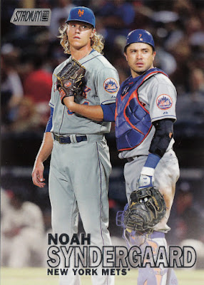
Anyhow, as you can see from the Syndergaard card in the lead-off spot, this year's Stadium Club bears a striking resemblance to '97 Fleer.
In case you've forgotten that old dusty set, here's a side-by-side comparison...
Whaddya think, sirs?
Well, the '97 Fleer cards had that sorta matte finish while the Stadium Club cards are drowning in gloss per usual. So, there's that anyways.
Hey, I guess companies have been ripping off one another for years with designs and design elements. Like with Upper Deck's "Vintage" line from the early 2000's that completely copied the look of classic Topps sets with slight variations here and there. All's fair, I guess.
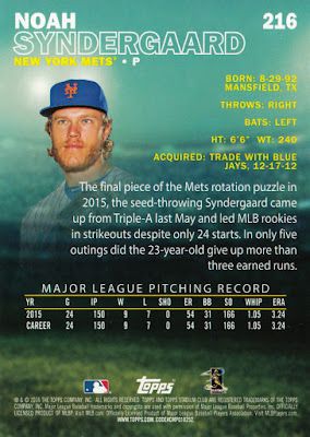
The back of the card, in case you're curious. Kind of an aquarium thing going one. Makes me think of Marlins Park. Not terrible at all, though. I actually quite like it.
Let me be clear: I'm not displeased or upset with the look of 2016 Stadium Club. Nor do I feel cheated. I liked '97 Fleer quite a bit, so this quasi homage to that design is A-OK with me. It certainly beats the stuffing out of this year's flagship.
I'll share the complete contents on my blaster once I have a chance to scan 'em all. I received a very nice assortment, including five of the 16 Mets in the set. Of course, the photos are off-the-charts great--it is Stadium Club, after all. I mean, just look at that Syndergaard card! (By the way, catcher Travis d'Arnaud somehow didn't make the checklist, but at least Topps threw him a bone with a pretty good cameo!)
Anyone else get their hands on these yet? Thoughts on the design?
MK


Haven't gotten any in-person yet (sadly), but I immediately thought '97 Fleer when I first saw the design on the 'net a few months ago. I love the back-to-basics look of the set, so I'm definitely on board with this year's Stadium Club. I smell a third-straight Set of the Year title for SC, I think.
ReplyDeleteNo doubt, Nick. This'll be a tough one to top.
DeleteI took a look on Friday, but couldn't find any. The one Target near where I work used to put things out before the official release date, but I think someone got ugly on them because now I'm lucky if I find anything within a week of the release date.
ReplyDeleteI like what I've seen so far, but that's only been images on people's blogs.
"It certainly beats the stuffing out of this year's flagship." Doesn't that apply to pretty much every other release this year?
"Whaddya think, sirs?" I didn't know that the invention exchange involved baseball card designs, but it *would* explain a lot. Push the button, Frank.
LOL! It's tough to sneak anything past you, Joe :)
DeleteEveryone has mentioned '97 Fleer with this set. It's so BLATANT.
ReplyDeleteAnd I don't like that. It's been done before. That's how close it is for me. The photos are absolutely fantastic, but I don't want to blow my money on another modern set, so I'm letting the font keep me from buying it.