I've been catching quite a few 2016 Donruss posts around the blogs, and mostly the words have been kind. I'm no paid employee or formal endorser of Panini, but I look at them as a somewhat viable alternative to Topps. And, as a free market advocate, I think options and/or competition are good things.
I haven't purchased any retail packs or blasters -- though I am seriously considering an investment in the latter -- but I was able to scoop up all eight Mets base cards for a dime apiece when I was at a card show a couple of weekends ago.
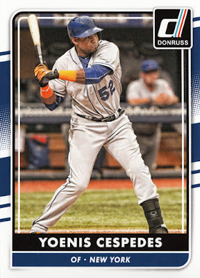
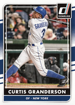
The design, like a year ago, has that old-time Donruss vibe about it, which I appreciate quite a bit. I think I favor this year's layout over its 2015 counterpart. Both are very good, however.
Most of the photos used for the base cards are far from imaginative or creative. Just meat 'n potatoes type of stuff, which I guess is O.K. It's better than having an overload of gimmicky photos, which is the direction Topps has been leaning towards in recent years.
The lack of logos and team names don't bother me so much, though, I still don't get why Panini can't at least use the exact colors for the uniforms. Not even a hint of orange on the numbers or letters of the jersey. Are they licensed to use just one color for every team?
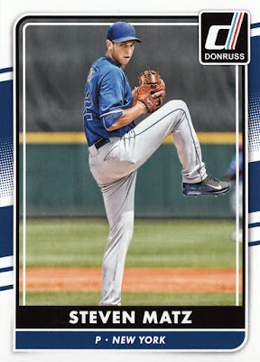
Certainly, the Panini folks have to be creative in the ways in which they go about choosing their photos, and that largely leads to the blandness of the final product. You can't really have front-on photos since the team name and logos are no-nos. Thus, we have many side profile images. The one of Thor is pretty darn good, though.
But then the feeling of deja vu eventually sinks in with the same or similar action photos.
Aside from the David Wright card in the lead-off spot, this might be my favorite of all the cards in this post. The overall presentation, from the photo selection to the centering to the framing, is just so nicely done. For those resistant to non-licensed cards: Do you not see anything redeeming here?
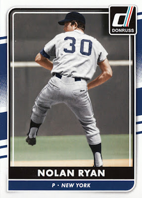
Perhaps the strangest inclusion is this Nolan Ryan card. Aside from the fact that it appears as if he's pitching for the Yankees (navy blue, anyone?), it's curious that Panini opted for Ryan as the lone retired Met in the checklist. I'm always glad when the card companies choose to do this because it means another card of the Express for my Mets collection. But, when you've got Seaver, Piazza, Gooden, Carter, etc. at the ready, you'd think they would go in a more obvious direction. Then again, I would've probably complained about that, too.
Now that I've got all the base Mets, the only reason I'd sink a 20-spot into a blaster of '16 Donruss is to try my hand at some of the cool inserts that accompany this product. Though, it might just make more sense to track down some of these via eBay or a SportLots type of site.
In any event, I give 2016 Donruss a positive rating. Given the limitations, a much worse product could have been offered up quite easily with little objection or remak from passers-by. But, in fact, I think the quality here is undeniable, and that's a credit to the Panini folks.
MK


I agree with your take, seems like a very solid non-licensed product. Logos/licensing would really put them over the top. How are the backs? A lot of times that's where Panini seems to struggle in my opinion...
ReplyDeleteNot too dissimilar to last year's, really.
Delete