 |
| My first card of 2013! |
Like a kid on Christmas Eve, it was very difficult for me to focus at work today. Today, after months of impatience, Topps 2013 baseball cards and I finally connected!
As the afternoon wore on, my attention increasingly centered on busting out of my office and hitting up Wal-Mart and Target on the way home. I had been seeing various bloggers post pics of 2013 Topps cards they had found at the aforementioned retailers, which only amped me up further.
Thus, when the 4 p.m. hour struck, I was away like lightning. First stop would be Wal-Mart, followed by the Bullseye. Thankfully, Wal-Mart was fully stocked because, as I later discovered, Target was not. Nada, nothing, zilch at Target in the way of 2013 Topps. Major bummer!
Anyhow, I settled on a pair of hanger boxes at Wal-Mart. The entire section appeared untouched, so I just swiped the first two boxes on display and made my way towards checkout. Originally, I had planned to snag a blaster, but I wasn't much interested in the commemorative patch card. Plus, the hanger boxes promised five blue-bordered cards. That was enough to sell me.
I had planned to get boxes or packs from each store, but since Target was a bust, my first Topps 2013 experience would have to be the two 72-card boxes from the W. Which, let's be honest, is more than enough. But, when new baseball cards debut, I tend to get a bit greedy. Can you blame me?!
The Montero card up top is the first 2013 card that met my eyes. I always think it's cool when other collectors and/or bloggers share their "first" card of the year, so I figured I'd follow suit. I think I drew a pretty good representative; good player and a cool photo of a catcher in action.
I've already been way wordier than I had intended with this post, so I'll try to just show cards and keep the verbiage to a minimum. But, you know how that goes.
Anyhow, away we go...

Some trends from 2012 Topps seem to have stuck for the '13 edition. Including very busy pictures of baseball exultation.

Tremendous play-at-the-plate action.
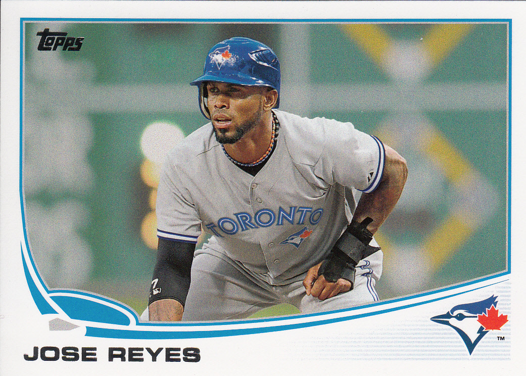
And, sigh, Photoshop magic. That's back-to-back years of Jose Reyes's base card featuring the fruits of digital editing. Not a bad job on this one, actually, but I'm so over this whole fad.
One fad that I do rather enjoy are retro jerseys. And it seems that Topps has consciously tried to feature them in this set. No complaints from me.

The two hanger boxes I chose produced lots of important base cards, including three Rookie Cups.


The card backs are nothing out of the ordinary, with one exception.

The "Career Chase" line underneath the player's acquisition summary and birth date is kind of different. The "chase" thing, it's part of the Topps story arc for this season, I get it. [Ed. Note: When did Topps decide that they needed a story arc for their card sets, by the way? Just curious...] For some guys, like Joe Mauer, the line isn't totally horse puckey. But, you know, some players' Chase line reads like, "With 5 base hits, Louie is only one billion hits away from the all-time record." Hyperbole, but you get the point, I think.
I found six cards of my beloved Mets, so that's always a good thing. Well, at least in my house.

The Santana is a checklist, but that's okay. I've seen the Ike Davis card via Twitter previously, but only picked up on the mid-flight ball by seeing it in person.
Okay, enough base cards. You've seen enough of them around the 'net to choke a horse. So let's move onto some parallels and inserts.


Ten blue-bordered parallel cards, but nothing sexy. I'm toying with the idea of shooting for a complete blue set. I'm partial to blue, what can I say. Not sure if this is the year I want to do it, but I definitely like how this design looks with blue borders.
As for the emeralds...


Ya know, I can't say that I'm gaga for these. I mean, they're okay and I'll probably like to get all my favorite players in emerald. But, just like the gold sparkles from last year, this is kind of a tired trend.
Oh, one note about parallels before moving on, I did not get a gold-bordered parallel in either box. The odds were 1:2, so some guy is going to get two gold-bordered cards if he buys a pair of these hangers. Poo to him.


Okay, some 1972 minis. I loved the '87s from last year mostly because they struck a personal chord. I'm not saying I don't like these (because I really do), but it's not the same as the '87s. I absolutely dig the backs of these, though. Makes me wish Topps cards were still cardboard and not posterboard or whatever they are now.
Other inserts:

Meh. I like it because it's Mike Trout. But, other than that, this looks more like a promotional card than an insert. Topps really mailed it in on this one.

Okay, this is a little bit better. The backs of these cards have a real cardboard feel, albeit thin stock. These "Calling Card" inserts have a kinda Gypsy Queen or A&G vibe to them. More so the former, I think. I'll have to scope out the checklist and see what other players are featured. In addition to Papi, I also got Prince Fielder. So, I don't know if this is an insert set devoted to overweight sluggers or what.

Okay, now here's where I get a bit confused. The above is a regular "Chasing History" card. The Reggie card, however, is shinier and features a golden ribbon, rather than the standard silver as in the Ryan. I got four of these gold/shiny inserts in each hanger box. And they were all packaged on the bottom of the card brick, not in the middle like the other inserts. So I'm not sure if these are Wal-Mart specials or maybe just an exclusive for hanger boxes. No idea. Anyone know the scoop?
Regardless, I really like these gold/shiny ones!

Very snazzy design, good photos of the game's greats, and not a lot of dead space as you might expect from an insert set that otherwise only exists as a vehicle for a jersey patch.
All told, I'm glad I went with the hanger boxes. I'm also happy to report that I didn't get a single duplicate, which is a rare feat for Topps anymore. I'm still deliberating a possible hobby box purchase. No rush on that front, but I don't know if I'm going to go crazy with the retail stuff if that's the case.
Anyhow, I hope all my fellow bloggers and collectors out there are enjoying their taste of 2013 baseball cards.
Baseball is back!
MK
That's weird. They photoshopped Reyes into a Jays uniform on the base card, but left his '72 mini as a Marlin (I assume, the back says Marlins). Ah, the Powers That Be at Topps is in need of an overhaul, but at least these look better than the previous three years.
ReplyDeleteAlthough I am finding myself preferring the colored borders (especially the black which looks fantastic) to the base.
I got a Chipper Jones and Alex Rodriguez Chasing history shinny, but they both have silver ribbons. I wonder?
ReplyDeleteMy Target Chasing Histories had silver and white ribbons !
ReplyDeleteGreat post brother. I posted a little bit after yours, but it seems like we have similar feelings. Great haul on your Mets, my hanger box only had one Friar, but was redeemed by a rack pack I picked up later.
ReplyDeleteI'm tired of the photoshopping as well. Heath Bell falls into the same category as Jose Reyes, two years in a row, photoshopped. I hate that he's a Diamondback now.
I'd like to see a set devoted to overweight players - period. John Kruk, Boomer Wells, Kirby Pucket, Dmitri Young, Pablo Sandoval, CC Sabathia, anybody with the last name Fielder, and of course, Tony Gwynn and Babe Ruth. "Large and In Charge" inserts? I'll email Topps, we can split the fortune.
The Chasing History cards need some light shed on them. The 10-pack blaster boxes come with non-refracting versions, but the rack packs (and the boxes it would seem) come with refracting versions. I wonder what the deal is.
ReplyDeleteYou should have gotten a blaster, bro! They contain 2 blue-borders per pack, so 20 blue cards instead of 10 for the same price as 2 boxes! The patch cards are pretty cool and basically free if you're buying that many cards anyway.
Hmmm. Maybe you have a point about the blasters after all...
Delete