I picked up a pair of rack packs jumbo packs 36-card packs (and a single loose pack for Gabriel, which will remain untouched), deciding not to go crazy. Since the little guy arrived on the scene, we here in the Kaz house have to tighten our collective belts a tad. So, my game plan is to be very sparse with flagship purchases this year, pooling all my available hobby dough on Heritage this spring/summer. I still want to have a complete 2014 Topps set, but I'm gonna just put a factory set on my wish list to Santa. Yeah, I know it's cheating, but you gotta do what you gotta do.
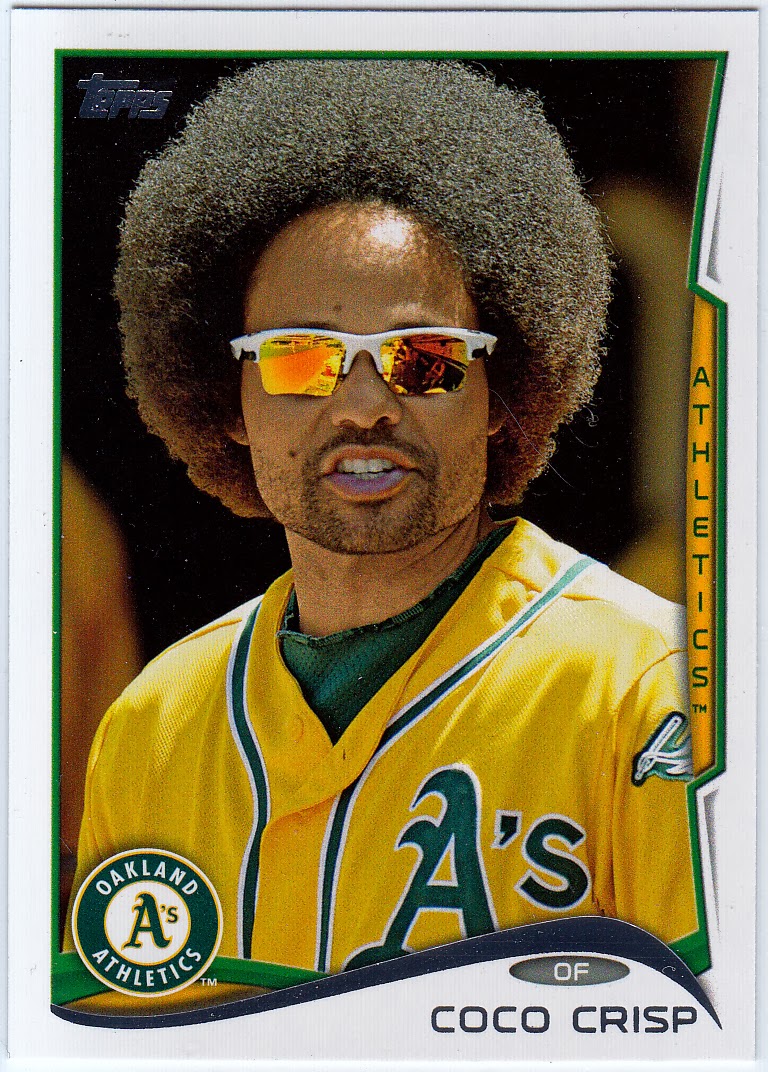
I won't torture you with too many base cards, as I'm sure you've seen your share -- as have I. Instead, I'll just show you my favorite of the batch, which you can see above in the form of Coco Crisp's fashionable coconut. I thought this might be one of those SP versions at first, but this is his actual base card, which I think is pretty cool.
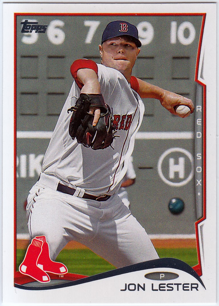
This Jon Lester was the first "official" 2014 card I pulled, so I figured I would share that. Normally, I'd put the year's inaugural card as the header of the post, but it's a rather plain photo and I didn't want anyone to ignore my blog on the count of a ho-hum card. I take it you're reading this post right now, so I guess I was successful.
My thoughts on the design? Like the rest of the world, I passionately dislike the Bowman-esque tab on the right-hand side of the card. It's unnecessary and clutters the frame. If not for the tab, this might be my favorite design of the decade so far. As it is, however, I'll take all four prior designs over it. But, it's growing on me since I had a chance to stare at the cards in person for a while. Who knows, by tomorrow I might be singing its praises (but probably not).

Okay, yes, I like the return of this subset, but is anyone else bothered that the cards say "Future Stars" (plural)? I see just one player on there, and in the olden days they were just called "Future Star" cards. A minor gripe, yes, but it's an accumulation of these little things that ultimately drive us batty (or at least just me). This, by the way, is a short print of Puig, one of two SP versions of card No. 331. A pretty nice score for your's truly!

I noticed what I perceived to be an honest effort by the Topps folks to have less boring pitcher cards. Last year, it seemed like every card of a hurler featured a photo of the guy in mid pitch or wind-up, etc., limbs cropped and cut and the whole nine yards. A cardboard yawnfest. But, interesting photos like the one used for this Chia-Jen Lo rookie spice up the checklist and make pitcher cards way less mundane.

Way too many parallels, you say? Well, I agree. I don't know what color this is supposed to be, but it looks much better in person (no it doesn't).
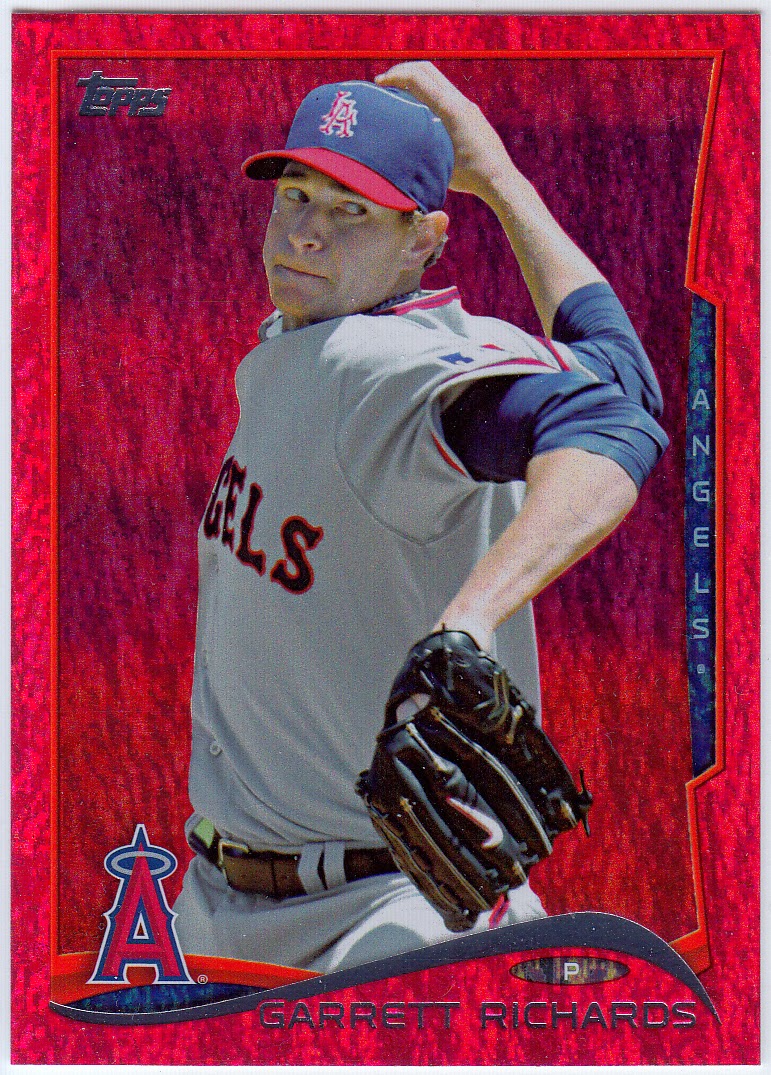
And, this is the red-hued cousin of last year's Emerald parallels. Not a huge fan. In the long run, these are just cards that curl up faster than any of the others.
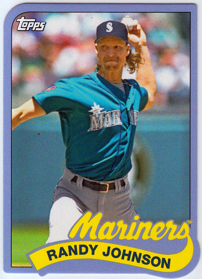
I was most excited to get a hold of one of these 1989 mini die-cuts. But I'm feeling a bit deflated after seeing this card of the Big Unit up close. What color is that, purple? That, or the wimpiest shade of blue ever concocted. Not even close to the blue used on the Mariners cards from '89. Also, did Topps do the unthinkable for the second straight year? Isn't '89 Topps one of the motifs tabbed for 2014 Archives? Kinda like the '72 minis in 2013 flagship, right? Ugh.
Nonetheless, because I"m an '89 Topps devotee, I'll pursue all the cards.
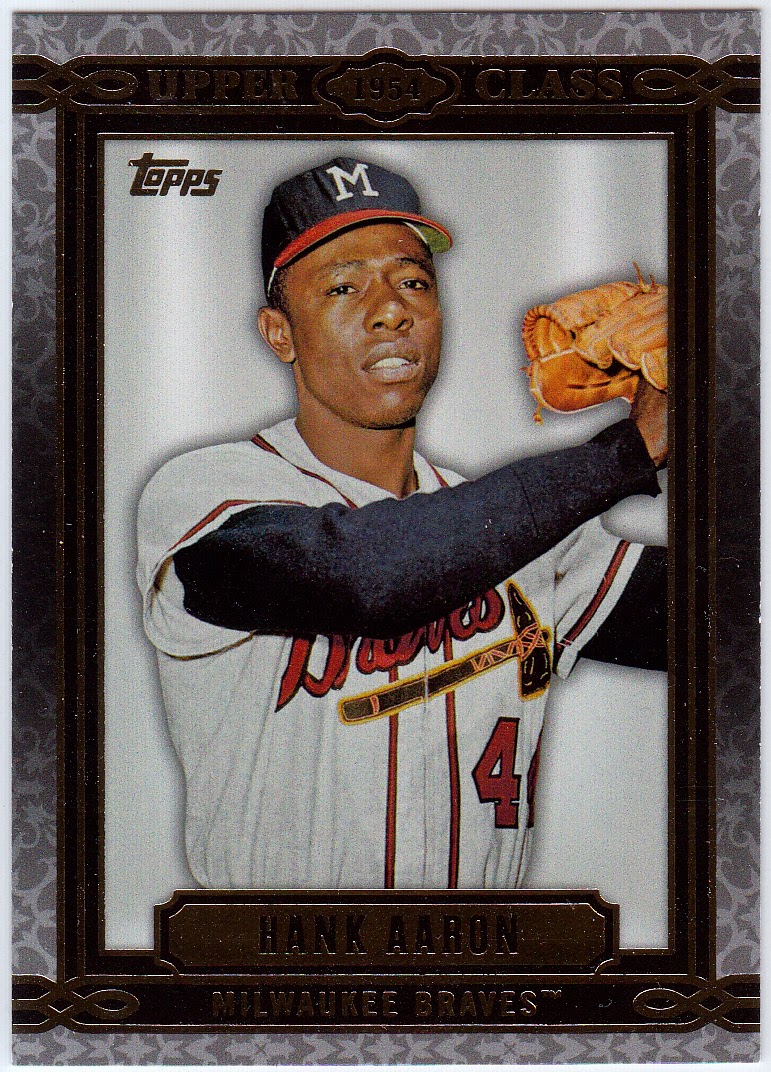
I was most impressed with these classy, attractive Upper Class cards. This I would collect. And I think I will. Might be the best looking insert Topps has made in a long time.
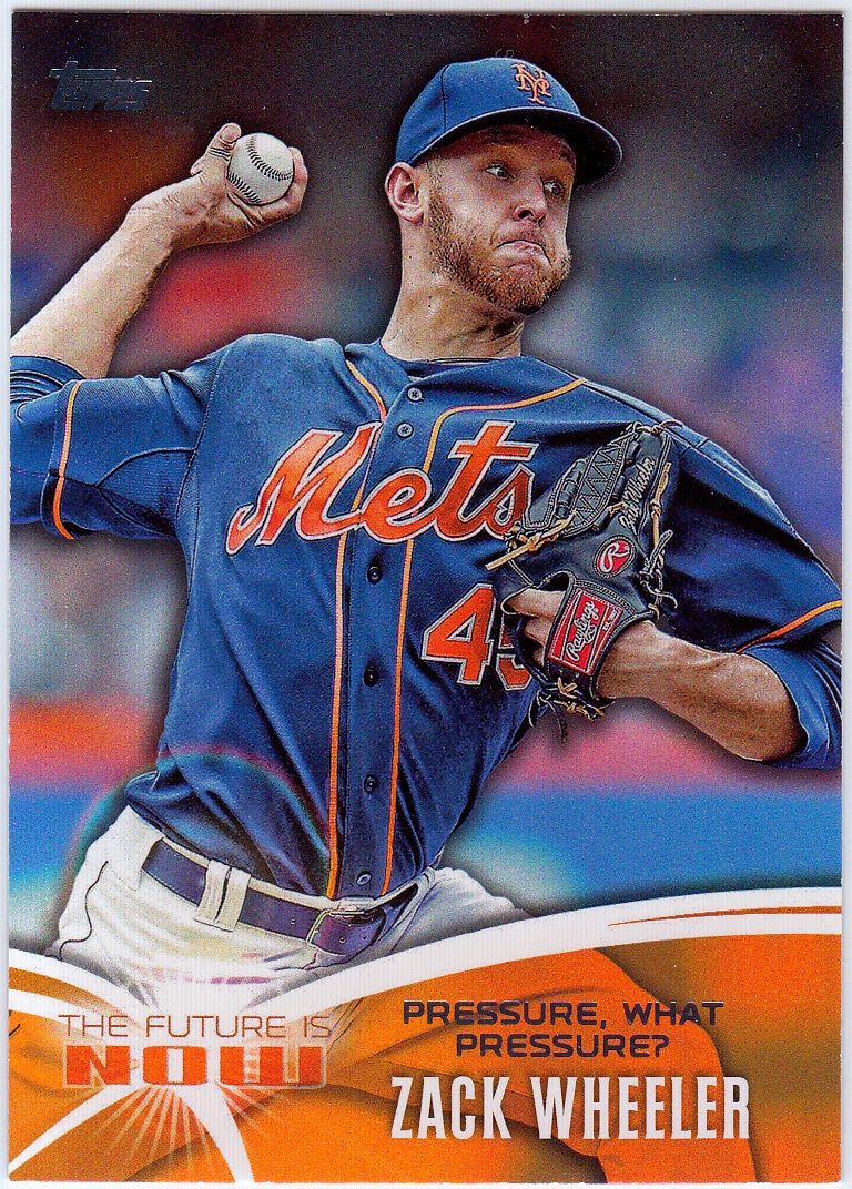
Only because it's Zack Wheeler do I even pay attention to this. Wasn't this design something Topps used for one of their sticker sets within the past five years? I will pass on this insert set.
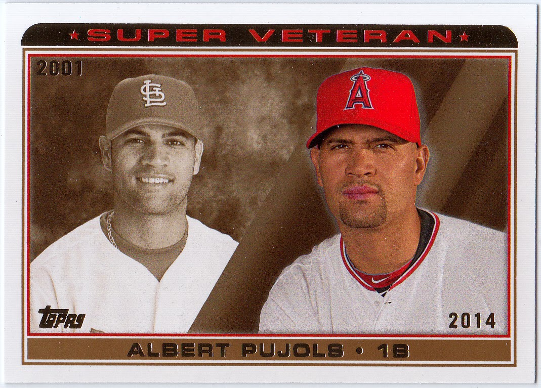
Kinda neat to see Super Veterans return, but isn't this something we would/should expect to find in Archives?
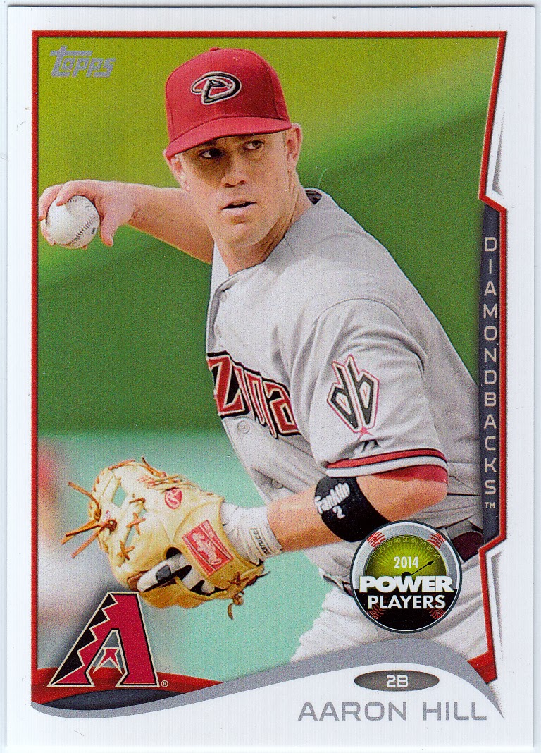
Not enthusiastic about this Power Players gimmick at all. I guess if you collect all 220 of these parallel cards, you get some sort of autographed set or whatever. But, really. Who and why?
Hey, when it's all been said and the dust settles, it's still the official kick-off of the 2014 baseball card season. And that's a wonderful thing. Sure we all have our list of gripes and notes for improvement, but I think 2014 does have its redeeming qualities. Let's let it sink in for a bit before we cast it aside as a lackluster venture.
MK
My beef with Topps are the cards of the players who are in Series 1 or no longer with the team featured on their card. Take Justin Ruggiano for example. He was traded to the Cubs on December 12th.
ReplyDeleteI guess Topps had already started their production run at that point and there was no going back? Bummer. That being said, if that Ruggiano needs a home let me know!
He/it is all yours!
DeleteLove the Aaron. Might be better to take the money for a pack and just buy the nice inserts individually on COMC or your preferred secondary marketplace. My feeling anyway.
ReplyDeleteAn excellent idea, and probably one I will employ.
DeleteVery cool to save a pack for Gabe! When does he get it?
ReplyDeleteI wanted to like the red foil parallels as much as I did the emeralds from last year, but I'm just not feelin' it. I think the blue of the Padre uniforms makes the red look purpley-pink, which is not a great look, since the Padres uniforms look bad enough already. I can see it looking good for certain teams though, like the Angels. Good observation on the pitcher cards, I've even seen a pitcher at the plate card on the blogospheres!
I figure I'll save one pack (per series) per year until he's old enough to know what to do with them. Then, they're all his to either preserve or rip into as he sees fit.
DeleteNice pull on the Puig SP, Mark! That Coco is an early nominee for "Card of the Year". I'm really hoping to pull that one out of a future pack of 2014 Topps.
ReplyDeleteIf it makes you feel any better, I have still not found any 2014 Topps... well, not any wax packs.
ReplyDeleteI don't want to buy more than a pack because - and stop me if this sounds familiar - I'm thinking that I'll just buy a factory set and focus on Heritage & vintage cards instead.
Great minds think alike!
Delete