Anywho, one of the funnest things about the Topps Fan Favorites brand -- which basically includes the SP portion of the current-day Topps Archives checklist -- is comparing and contrasting the new-school cards with their ancestral versions. At least I think it's fun.
So with gobs of time on hand, I thought it would be neat to take the six short-printed Fan Favorites cards I own from this year's Archives and pit 'em card v. card with the originals to see which is the most visually appealing.
Let's have a go! (Note: Original versions to the left; Archives Fan Favorites to the right.)
Round 1: '86 Vince Coleman


Vince Coleman was the embodiment of speed on the baseball diamonds of the National League during the '80s. Thus, any card that captures him in the act of theft, I think that's an extremely good thing.
Verdict: 2013 Archives draws first blood.
Round 2: '87 Juan Samuel


Hmm, not a whole lot that separates these two. In the act of swinging; powder-blue uniform; sunny afternoon. Solid contact and a dusty uniform on the original, though, so...
Verdict: Old School takes this round and is on the board, 1-1.
Round 3: '89 Howard Johnson


Boy this is a rough one. On one hand, the original '89 HoJo is one of my favorites for sentimental reasons, as I can vividly recall opening the wax pack that contained this card. Uh oh... Fasten your seat belts, I feel a story coming on! [Ed. Note: Picture it, Monroe Township, NJ, June 1989...] One of my sister's guy friends had a birthday party during the summer of '89 and everyone who attended got a goodie bag which included a pack of cards. Well, all the girls and many of the boys felt they were too cool for baseball cards and, therefore, dumped them all unto me. I was lucky I decided to tag along with my mom when she went pick my sister up from this party, I can tell ya that much. Anyhow, this card was among many I met that day, and I was a happy lil' husky boy. Buuuuut, on the other hand, the photo choice on the 2013 effort is just so perfect.
Verdict: Gotta go with my heart on this one. Old School takes a 2-1 lead.
Round 4: '90 Gregg Jefferies


I wonder: Are these two photos part of the same batting sequence? That would be pretty cool if it were the case. Irrespective of that, the '90 archival version is one of my favorites from that particular set. Look at the intensity of Gregg's face during that swing!
Verdict: A no-brainer, 1990. The Originals are now ahead by two runs!
Round 5: '92 Darren Daulton


The original '92 is pretty good, but its Archives cousin-from-the-future has a couple things going in its favor. Number 1, it's not a spring training photo and, Number 2, it's a Shea Stadium snapshot.
Verdict: New School takes it, and now trails by just 1.
Round 6: '93 Travis Fryman
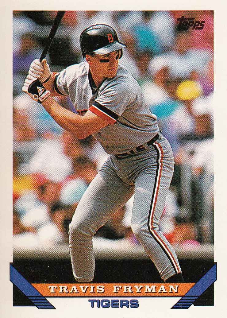

Neither of these will set the world on fire. The original Fryman showcases the Detroit third baseman's distinctive crouched batting stance, which works for me.
Verdict: Give it to the Old School. Game Over, 4-2!
Okay, so if I was being unbiased, I'd have given the HoJo round to the 2013 version and we'd be deadlocked at three, headed for extra innings. But it's my blog and I'll be biased if need be.
On the whole, I think Topps did a pretty satisfactory job with their Fan Favorites reprints, keeping the essence of the eras and choosing attractive photos and so forth. I'll certainly look forward to getting a few more of these and having a few more face-offs before I put 2013 Archives to bed.
You know, in case scrubbing the bathtub or pulling weeds becomes tedious.
MK
I think the Daulton should have been DQ'd because Topps used completely different fonts... not just a slightly different font. That Phillies script looks like they chose it out of a hat. Of fonts. Which would be a weird thing to have.
ReplyDeleteDuly noted. And, yeah, Topps is pretty sucky at matching fonts that THEY produced. Go figure, right?
DeleteEach card vs. it's counter part in a best of 7 (based on my sole subjective opinion)
ReplyDeleteNew Vince 4, Old Vince 1 - Every Coleman ever printed should of been of him running the bases
Old Juan 4, New Juan 2 - Dirty uniform gives old Juan the win
HJ series canceled due to lack of interest and general disdain for Howard Johnson
Old Jefferies 4, New Jefferies 3 - both are nice looking cards, I'm one of the minority that loves '90 Topps
New Daulton 4, Old Daulton 1 - Darren's head looks too small for his body on the original
Old Travis 4, New Travis 2 - photo is a little blurry on the new one.
I love this. Well, except for the HoJo part. But, I can understand where you are coming from (WallachLand).
DeleteCollecting baseball cards is both an investment and a fun hobby, Mark. These cards definitely have captured all the remarkable events in these athletes' careers, as well as, their goals, their signature moves, and transition of their uniforms through the years. Linnie @ UniformsExpress.com
ReplyDeleteChecking your card collection after some time is one of the best ways to enjoy your stay-cation, Mark! It’s nice to see the different versions of cards that you’ve got, and I’m pretty amazed on how observant you are on their specific qualities that makes them unique. Well, I wonder if you also have a collection of their baseball uniforms. Hehe! Anyway, thanks for sharing!
ReplyDeleteJennine Stalder @ UE Sports